Itiyopiya F. Ewart, PLLC Logo & Brand Guidelines
Itiyopiya F. Ewart, PLLC Logo & Brand Guidelines

Project Overview
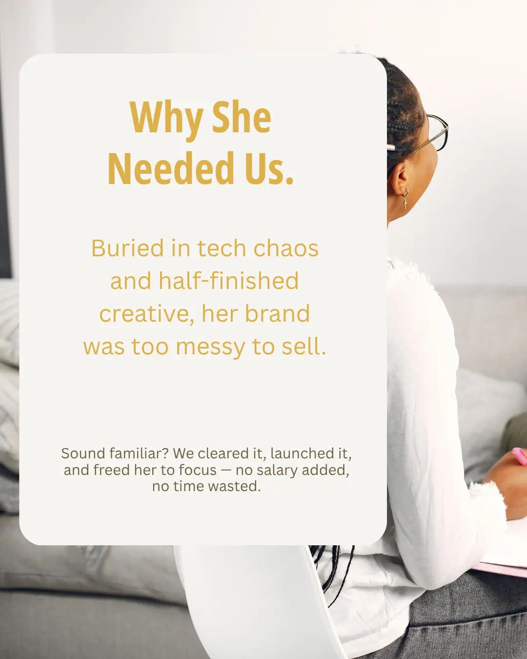
When Itiyopiya reached out, she was caught in a cycle every founder knows too well — ideas everywhere, execution nowhere. Her vision was strong, her message powerful (“Happiness Is Your Birthright”), but her brand was buried under tech tangles, half-finished files, and inconsistent visuals that couldn’t sell her credibility.
Our mission: clear the creative clutter, build a brand that feels as calm as her message, and free her to focus on serving clients instead of fixing Canva templates.
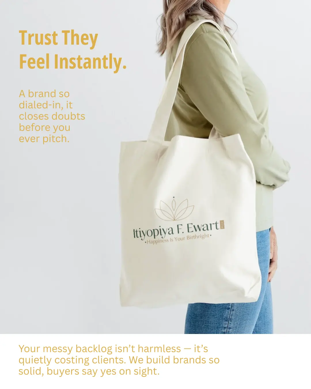
A refined logo and cohesive design instantly communicate trust—before a single word is said.
Confidence You Can See
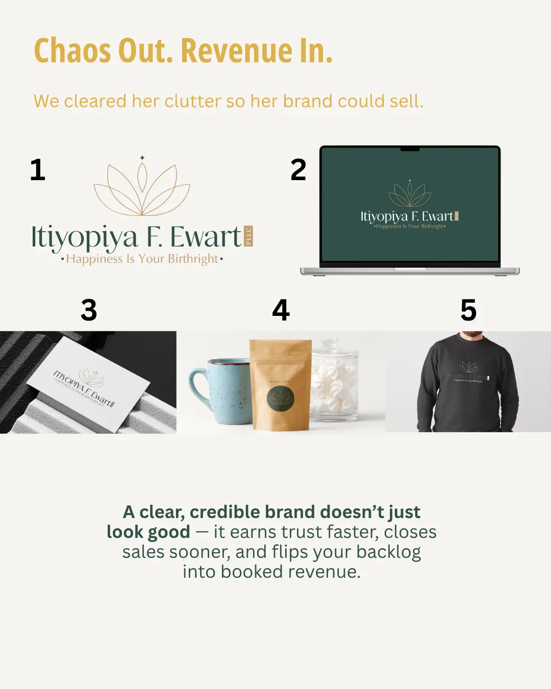
We started by grounding her brand in tangible proof — the kind you can touch, print, and sell with. We took her scattered ideas and turned them into real-world collateral: mugs, packaging, stationery, and apparel that showed her professionalism on every surface. For the first time, her brand looked as solid as it felt.

Every font, color, and layout was chosen to simplify decisions and bring calm to both client and creator.
Designed for Ease
Trust isn’t something you explain — it’s something your brand communicates instantly. We built a cohesive visual identity that closes doubts before she ever pitches. Every font, color, and layout was chosen to reflect warmth, reliability, and presence. Now her audience doesn’t just see her — they believe her.
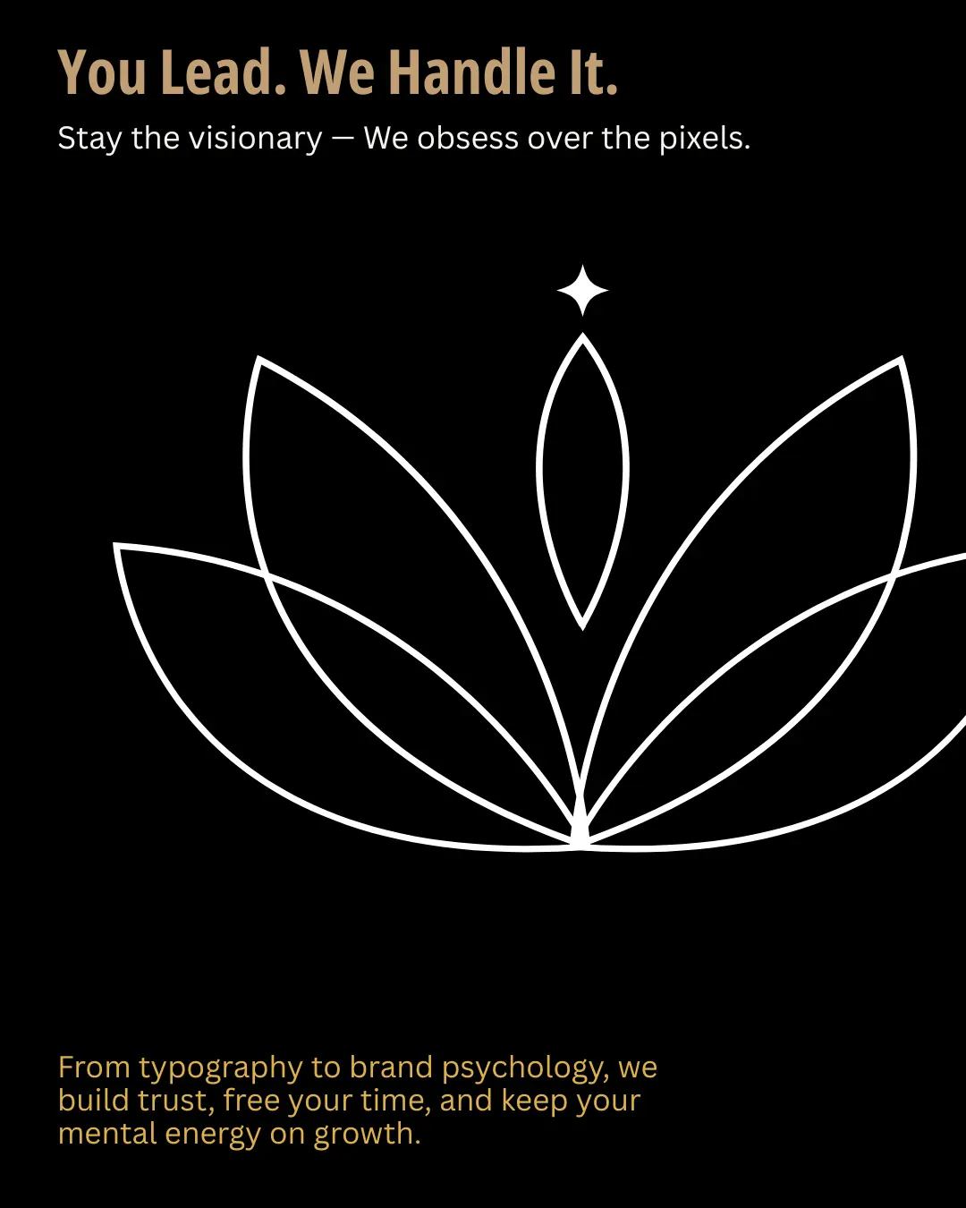
The lotus mark became a signature symbol—stopping scrolls, earning clicks, and creating brand recall.
Recognition That Converts
We rebuilt her entire visual system from the inside out — typography, file organization, logo structure, and color management — to remove chaos from her day-to-day. The result: a brand that operates as smoothly as it looks. Her clients experience clarity; she experiences calm.
A Brand That Works Everywhere
A strong logo isn’t art — it’s a trigger for recognition. Her lotus mark became her figurehead, catching attention across shelves, feeds, and screens. Whether on TikTok, packaging, or email banners, it gives her brand instant visual authority. Her look now works where it matters most: where buyers decide.
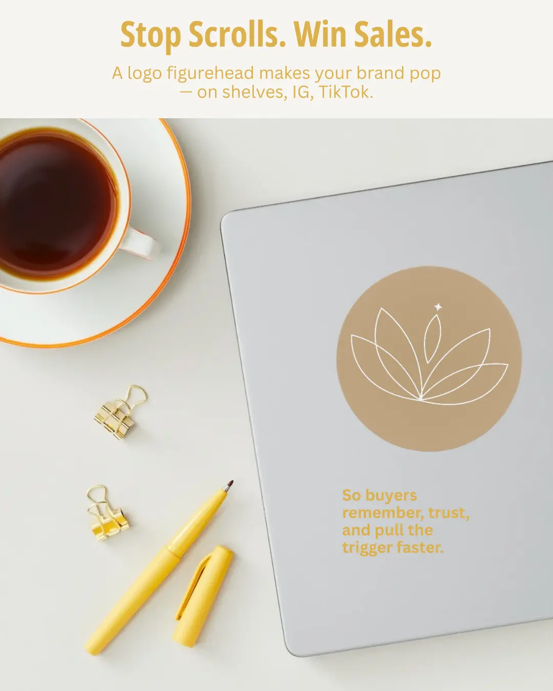
From packaging to posts, her visuals now scale seamlessly across print, merch, and digital platforms.
Beauty That Builds Trust
We kept her in the visionary role — setting direction, defining meaning — while we handled every execution detail. From brand psychology to color calibration, our work freed her time and mental energy to focus on growth. She stayed the leader; we made the brand follow through.
Bridged ancient healing and modern care so practitioners could explain energy with confidence.
Clearing the Backlog
We designed with one purpose: conversion. Every decision was filtered through clarity, consistency, and performance. Because a professional brand isn’t about looking pretty — it’s about making profit predictable. With her refreshed identity, buyers now say “yes” sooner and more often.
Bridged ancient healing and modern care so practitioners could explain energy with confidence.
From Chaos to Clarity
Like many founders, she was buried under digital clutter and unfinished creative. Her brand had potential but lacked polish — and that gap was quietly costing her clients. We cleared it, launched it, and freed her from the friction, without adding hires or overhead.
This is what backlog recovery looks like: fast, focused, and freeing.
Bridged ancient healing and modern care so practitioners could explain energy with confidence.
Once her brand was unified, her presence became powerful. She started booking confidently, knowing her visuals carried the professionalism she’d always wanted to project. Her trust factor skyrocketed — and so did her bookings. No extra staff. No burnout. Just systems that sell.
Bridged ancient healing and modern care so practitioners could explain energy with confidence.
The Payoff of Professionalism
We cleared her clutter so her brand could finally convert. From logo to laptop, every touchpoint now speaks one language: credibility. A clear, consistent brand doesn’t just look good — it sells better, faster, and with less effort.
When your visuals do the talking, your calendar fills itself.
☕ Book Your Strategy Session
Ready to turn that clarity into a real plan?
Schedule an in-person strategy session with Will Mosley at Switchyards Asheville.
You’ll walk away with a custom action plan, clear next steps, and fresh creative energy — coffee & tea included.
👇
Project Details
Tags
- 1Design
- 2Branding
- 3Strategy
