

Overview
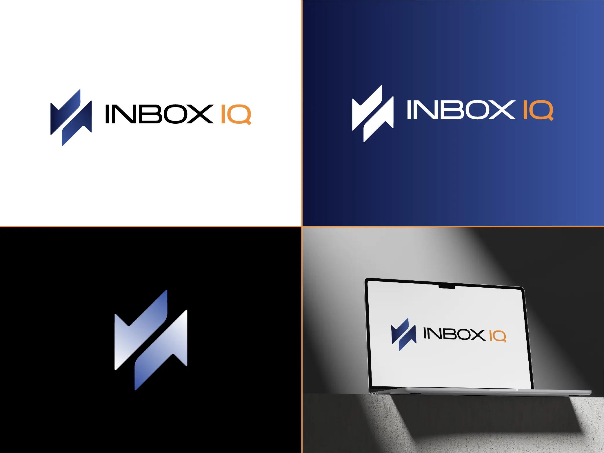
Inbox IQ now has a polished, flexible logo system built to remain recognizable across light, dark, and digital environments.
The identity combines a bold geometric symbol with a clean, modern wordmark. Deep navy and blue establish the primary color direction, while the orange “IQ” creates a clear point of emphasis within the name.
Complete Identity System
The complete presentation shows how the Inbox IQ identity works as a unified system rather than a single logo. It includes light and dark logo variations, a standalone brand mark, and a realistic digital application.
Together, these variations give Inbox IQ an identity that can adapt to different backgrounds and formats while maintaining a consistent visual presence.
Primary Logo
The primary logo pairs the geometric Inbox IQ symbol with a streamlined uppercase wordmark.
The navy and blue symbol provides a strong visual anchor, while the orange “IQ” separates the final portion of the name and adds contrast. The generous spacing and simple white background keep the presentation clear and professional.
This version is well suited for documents, websites, presentations, and other light-background applications.
Dark-Background Logo
A reversed version was created for dark or color-rich environments.
The white symbol and “INBOX” lettering remain highly visible against the navy-to-blue gradient, while the orange “IQ” preserves the signature accent from the primary version.
This variation gives Inbox IQ a consistent identity for dark website sections, social graphics, presentation covers, and other digital materials.
Standalone Brand Mark

The standalone mark distills the identity into a compact geometric symbol.
Its angular, interlocking construction creates a distinctive shape that can be recognized without the full company name. A blue gradient adds dimension while keeping the mark clean and minimal.
This version can support smaller applications such as profile images, icons, favicons, app graphics, and branded accents.
Digital Application
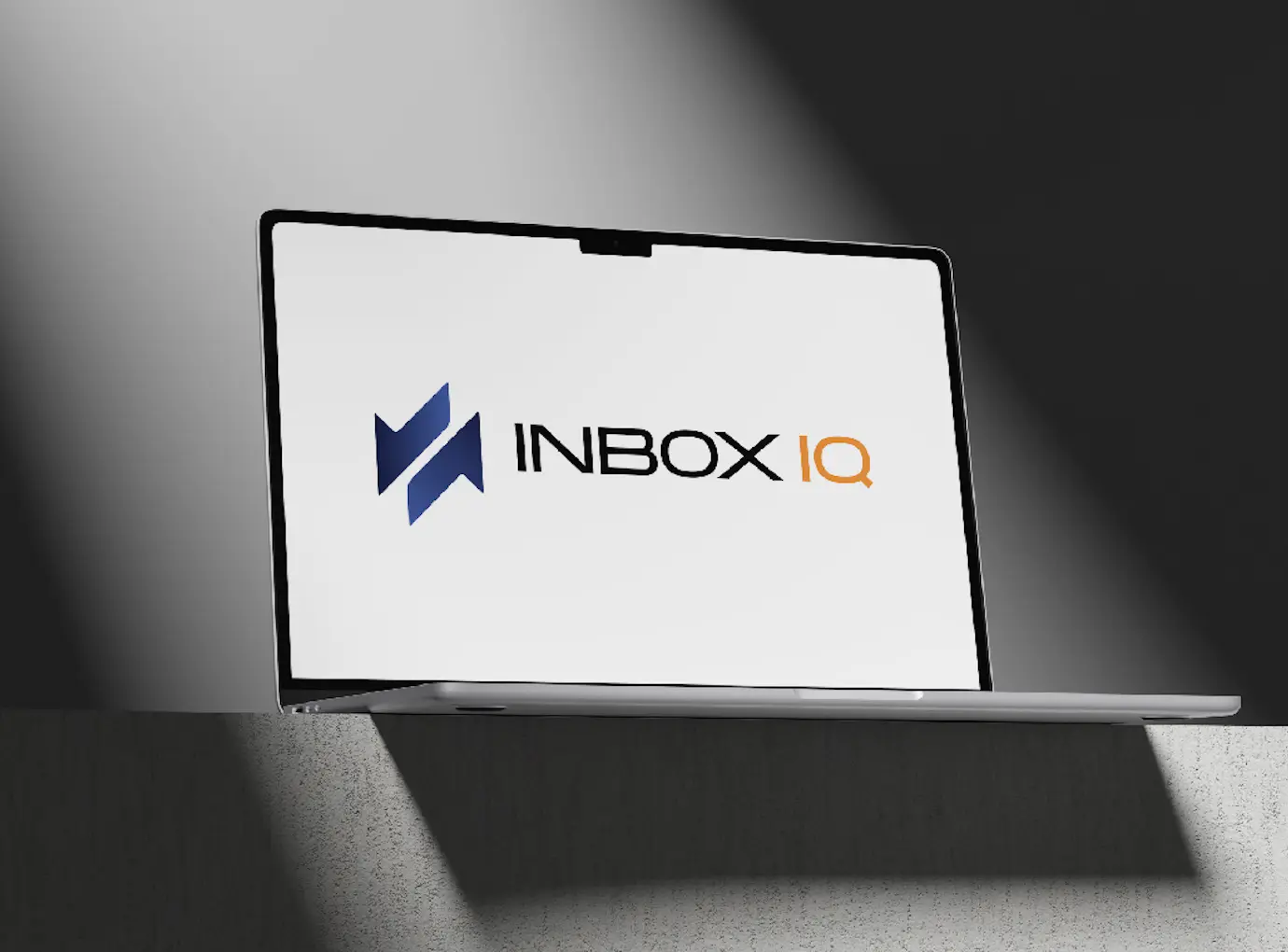
The laptop mockup demonstrates how the complete logo appears in a realistic digital setting.
The mark and wordmark remain clear at screen scale, and the blue-and-orange color combination stands out against the neutral display. This application helps show how the identity can carry into websites, software interfaces, presentations, and other screen-based experiences.
Final Identity
Inbox IQ now has:
- A primary full-color logo
- A reversed logo for dark backgrounds
- A standalone brand mark
- A defined navy, blue, white, and orange color direction
- A logo system suitable for both digital and presentation use
- A realistic example of the identity in application
The result is a cohesive and adaptable visual identity that gives Inbox IQ multiple ways to present the brand while remaining consistent and recognizable.
Tasks Completed
- 💡 Logo Concept Development: Developed the overall visual direction for the Inbox IQ identity.
- 🔷 Brand Mark Design: Created a distinct geometric symbol that can work independently from the company name.
- 🔤 Wordmark Design: Developed the Inbox IQ wordmark with emphasis placed on “IQ.”
- ✍️ Typography Selection: Selected a clean, modern type style to support the visual identity.
- 🎨 Color Palette Development: Established a palette using navy, blue, white, and orange.
- 🖼️ Primary Logo Creation: Created the primary full-color logo for use on light backgrounds.
- 🌙 Reversed Logo Creation: Prepared a high-contrast logo variation for dark and colored backgrounds.
- 🔹 Standalone Icon Creation: Prepared the brand mark for compact uses such as icons and profile images.
- 🧩 Logo System Development: Created coordinated logo variations for consistent use across different formats.
- 💻 Digital Mockup Presentation: Presented the finished identity in a realistic screen-based application.
- ✅ Final Logo Refinement: Refined the logo’s spacing, balance, color, and overall presentation.
- 📦 Logo File Preparation: Prepared the final logo variations for practical digital and presentation use.
Project Details
A modern brand identity for Inbox IQ featuring a geometric brand mark, clean wordmark, versatile light and dark logo variations, and a distinctive navy, blue, white, and orange color palette.
Tags
- 1Brand Identity
- 2Logo Design
- 3Visual Identity
- 4Geometric Logo
- 5Logo System