

Overview
Voll Polarity needed a two-sided educational flyer that could explain a complex wellness therapy in a way that felt clear, credible, and visually engaging.
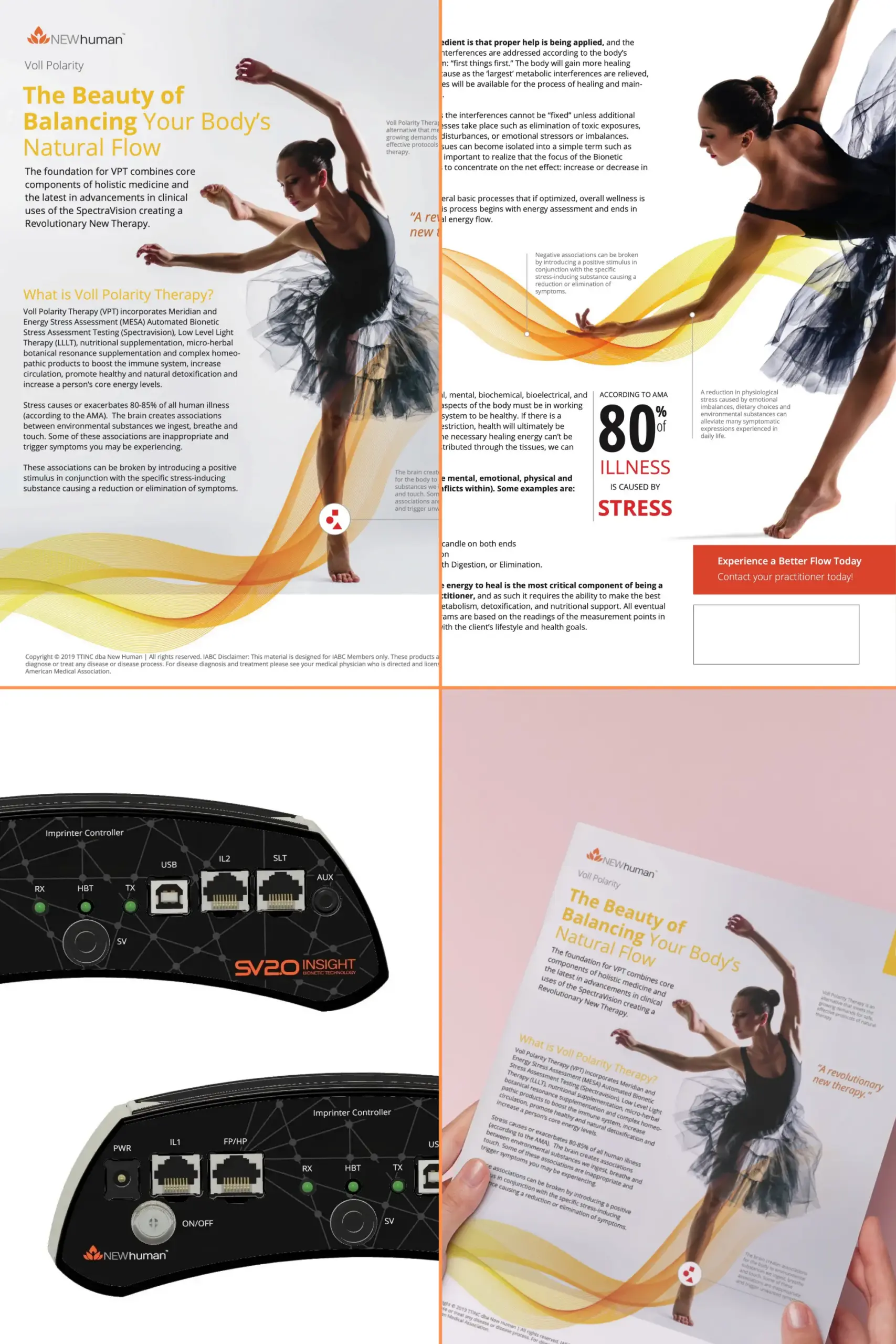
The final piece presents Voll Polarity Therapy as “The Beauty of Balancing Your Body’s Natural Flow,” using a graceful dancer, warm energy-wave graphics, and clean editorial spacing to connect the idea of energetic balance with a more approachable visual language.
Rather than relying on heavy technical copy alone, the flyer uses movement, balance, and flow as the core visual metaphor.
Educational Two-Sided Flyer
The flyer was built as a two-sided print piece for New Human.
The front side introduces the concept with the headline “The Beauty of Balancing Your Body’s Natural Flow” and explains that Voll Polarity Therapy combines holistic medicine, SpectraVision clinical advancements, low level light therapy, nutritional supplementation, and homeopathic support.
The back side expands the explanation by addressing stress, energetic interference, and the practitioner’s role in helping the body restore proper flow.
Together, the two sides create a complete educational handout that can be used by practitioners to introduce the therapy, explain the concept, and encourage a next step.
Visual Concept
The visual direction centers on a ballet dancer in motion.
The dancer creates an immediate sense of balance, grace, control, and natural movement. This directly supports the core message of the flyer: helping the body return to a healthier natural flow.
Orange and yellow wave graphics move across both sides of the layout, reinforcing the idea of energy, circulation, and release. The design uses these wave forms to connect the flyer’s wellness message with a visual rhythm that feels light, warm, and human.

Front-Side Message
The front side establishes the primary promise of the piece:
“The Beauty of Balancing Your Body’s Natural Flow.”
The supporting copy introduces Voll Polarity Therapy as a foundation built from multiple wellness components, including Meridian and Energy Stress Assessment, Automated Bionetic Stress Assessment Testing, SpectraVision, Low Level Light Therapy, nutritional supplementation, micro-herbal botanical resonance supplementation, and complex homeopathic products.
The page also explains that stress may create associations between environmental substances and symptoms, and that positive stimulus can help reduce or eliminate those symptoms.
The design keeps this information readable by pairing the longer text with large visual space, clear hierarchy, and a strong central image.

Back-Side Message
The back side goes deeper into the mechanism and rationale behind the therapy.
It explains that proper help must be applied according to the body’s priority system: “first things first.” The copy describes how resolving the largest metabolic interferences can free more resources for healing and maintaining health.
The flyer also explains that some interferences cannot be “fixed” until supporting processes are addressed, including toxic exposures, chronic focal disturbances, emotional stressors, or imbalances.
A major emphasis is placed on the idea that the practitioner’s focus is not simply to chase symptoms, but to concentrate on the net effect: increasing or decreasing energy flow.
Stress + Wellness Framing
The flyer uses stress as the main bridge between the technical therapy explanation and the audience’s everyday experience.
One of the strongest visual/message moments is the statistic callout:
“According to AMA, 80% of illness is caused by stress.”
The back side also names common blocks such as:
- Stress
- Overwork
- No sleep
- Burning the candle on both ends
- Poor nutrition
- Problems with digestion or elimination
This gives the flyer a practical anchor. It connects the therapy to recognizable life patterns instead of leaving it as an abstract technical system.

Product + Technology Context
The presentation includes the SpectraVision / SV2.0 Insight device imagery, which gives the flyer a stronger technology and practitioner context.
This supporting visual helps clarify that the flyer is not only about wellness language or lifestyle imagery. It is connected to a specific assessment and therapy ecosystem.
By pairing the device imagery with the dancer and energy-flow graphics, the project balances two sides of the brand: clinical technology and whole-body wellness.

Print Presentation
The flyer was also presented in a realistic hand-held mockup.
This helps show how the piece functions outside the flat design file. The mockup makes the flyer feel tangible, practical, and ready for real-world use by a practitioner, clinic, or wellness brand.
The final presentation demonstrates the full asset set:
- Full two-sided flyer layout
- Front-side flyer detail
- Back-side flyer detail
- Supporting SpectraVision / SV2.0 device imagery
- Realistic printed flyer mockup
Final Flyer System
Voll Polarity now has:
- A two-sided educational flyer
- A clear headline and front-side introduction
- A detailed back-side explanation of stress, interference, and energy flow
- A visual metaphor built around balance, motion, and natural flow
- Warm wave graphics that reinforce the therapy concept
- Supporting technology imagery for credibility
- A realistic printed mockup for portfolio presentation
- A practitioner-facing call to action: “Experience a Better Flow Today”
The result is a polished print piece that turns a complex wellness therapy into an accessible, visually cohesive educational handout.
Tasks Completed
- 💡 Flyer Concept Development: Developed the overall creative direction around balance, motion, wellness, and natural flow.
- 🧘 Wellness Message Framing: Structured the flyer around the promise of helping the body return to a healthier energetic balance.
- ✍️ Educational Copy Layout: Organized dense therapy explanation copy into a more readable two-sided flyer format.
- 🖼️ Front-Side Flyer Design: Created the primary flyer side with headline, introductory therapy explanation, dancer imagery, and energy-wave graphics.
- 📄 Back-Side Flyer Design: Created the secondary side with deeper educational content about stress, interference, energy flow, and the practitioner’s role.
- 🎨 Visual Metaphor Development: Used the dancer, movement, and flowing wave graphics to express balance, vitality, and natural flow.
- 📊 Statistic Callout Design: Highlighted the stress-related wellness statistic as a strong educational and visual anchor.
- 🔬 Technology Context Integration: Included SpectraVision / SV2.0 Insight device imagery to connect the wellness message to the supporting assessment technology.
- 🖨️ Print-Ready Presentation: Prepared the flyer as a two-sided print asset with clear hierarchy and practical handout use.
- 📸 Portfolio Mockup Creation: Presented the flyer in a realistic printed mockup to show how the final piece appears in use.
- 🧩 Asset Set Preparation: Created supporting visuals for the project page, including full layout, detail views, device imagery, and mockup.
- ✅ Final Portfolio Packaging: Prepared the project for website presentation with case study copy, project details, and portfolio-ready positioning.
Tags
- 1Print Design
- 2Flyer Design
- 3Wellness Marketing
- 4Educational Handout
- 5Healthcare Collateral
Project Details
A two-sided educational flyer for New Human’s Voll Polarity Therapy, designed to explain a complex holistic wellness system through clear copy, dancer imagery, warm energy-flow graphics, SpectraVision technology context, and a realistic print presentation.
Tags
- 1Print Design
- 2Flyer Design
- 3Educational Handout
- 4Healthcare Collateral