Book is out of sight
The first screen is a photo and a word like Relax. Book is three screens down, or behind the menu icon.
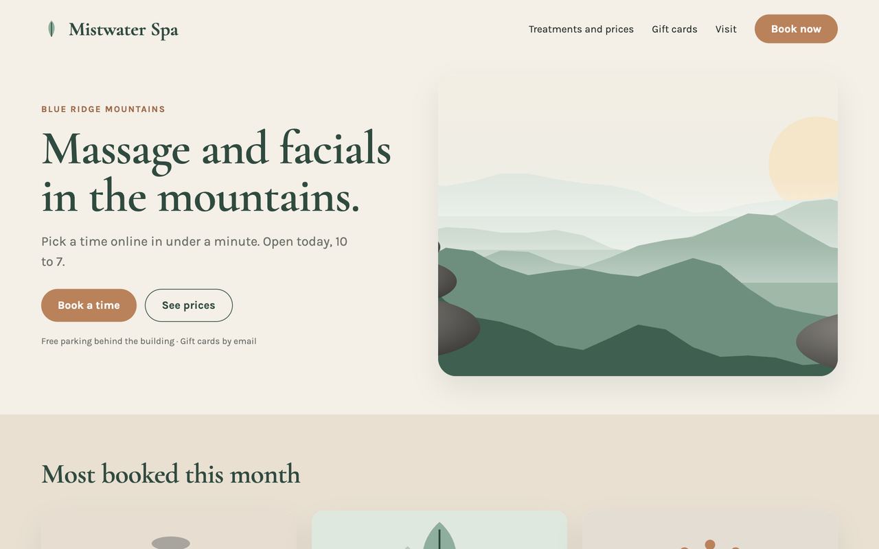
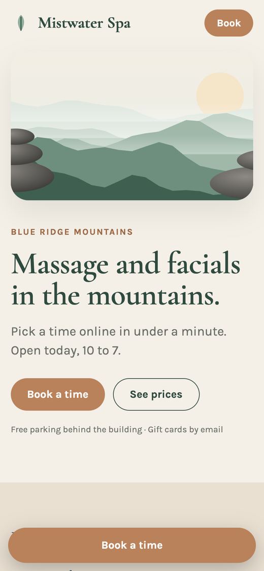
Option A puts Book in the header and keeps a Book bar on the phone.
 Holiday-Ready Day: Your first request is free. →Your whole web and marketing team. Your first request is free.Your first request is free. →

We opened 10 WNC spa homepages on a phone. Half had no Book button on the first screen. Your first fix is free.
10 WNC spa and wellness homepages, opened on a phone on November 10, 2026.
had no Book button on the first phone screen.
showed no price anywhere on the homepage.
showed no gift card on the page itself, in November.
Most spa homepages are built to feel calm, and they do. The trouble starts when a visitor on a phone wants to know three things: what can I book, what does it cost, and where is the button.
The first screen is a photo and a word like Relax. Book is three screens down, or behind the menu icon.
Option A puts Book in the header and keeps a Book bar on the phone.
Services show as names and photos. To learn what an hour costs, a visitor has to find the menu page or pick up the phone.
Option B leads with the menu: time, treatment and price, each with its own Book button.
November and December bring gift buyers, who are not booking for themselves. On 4 of these homepages a gift card was nowhere on the page itself: 2 kept it inside the menu, and 2 had none.
Option C opens on gift cards through the holidays, with Book one line below.
This is how we show an owner their options: their homepage today, then three directions built from their own words, photos and prices. Here we drew a made-up spa so you can see the method without seeing anyone's real site.
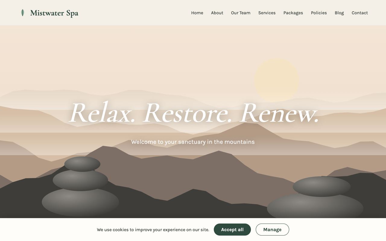
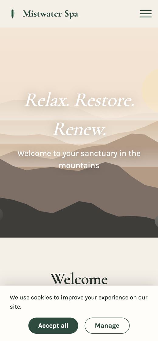
Calm and pretty, and a lot like the homepages we checked.
For a spa whose calendar has room: every screen has a way to book.
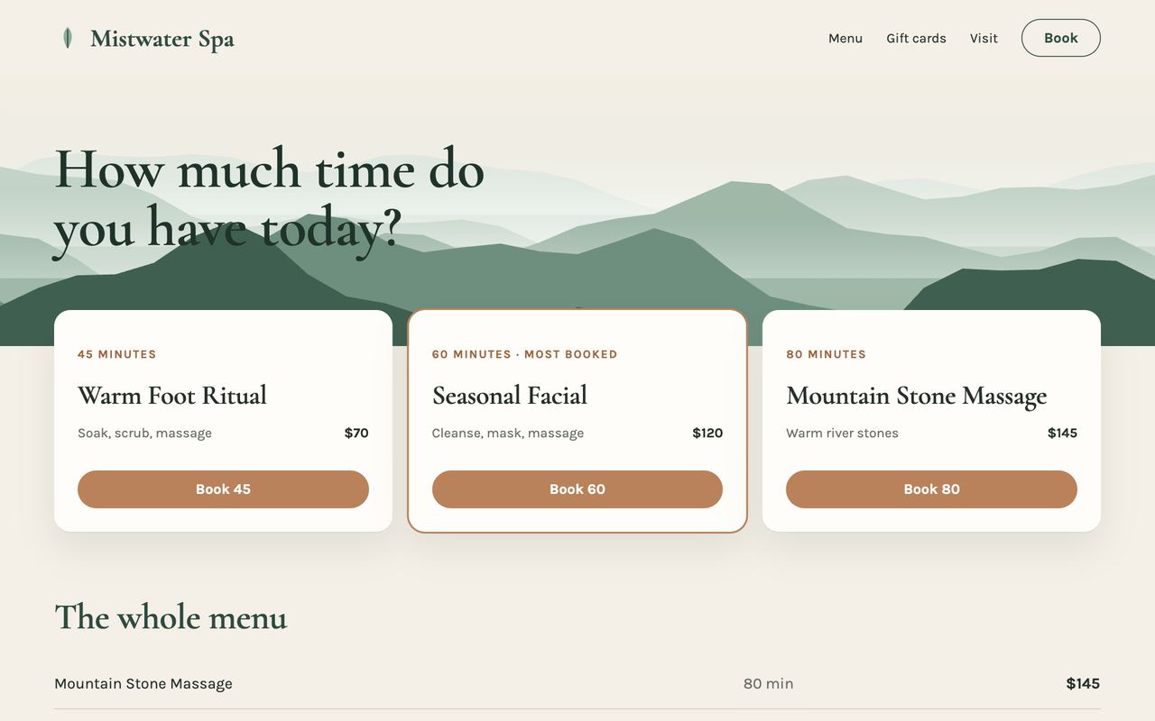
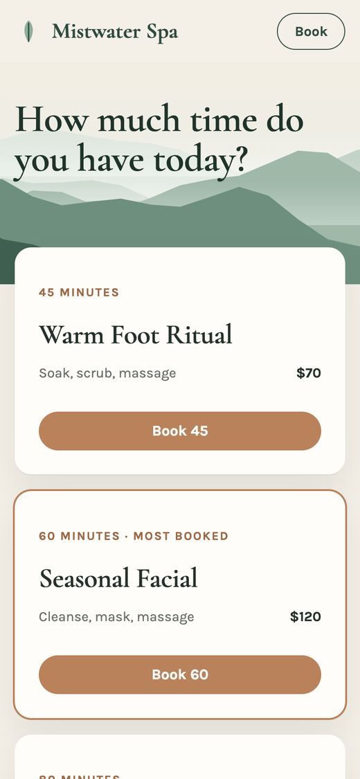
For a spa that gets the same question all day: how much is it?
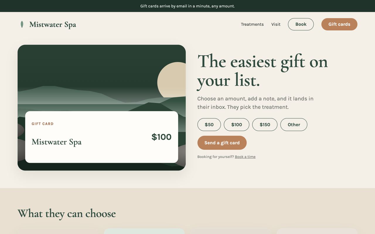
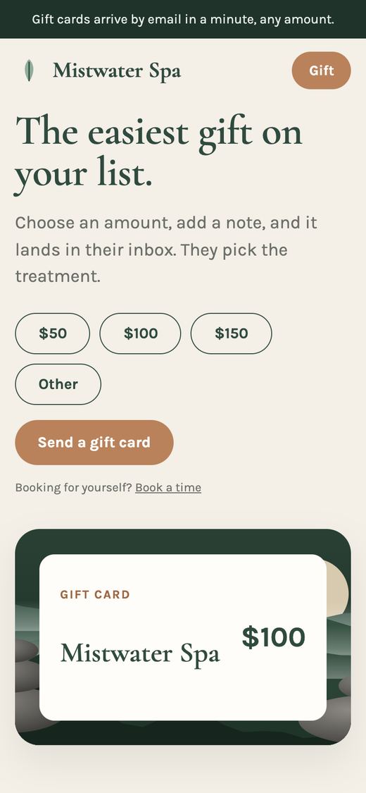
For November and December, then swapped back to Book first in January.
Mistwater Spa is not a real spa. We drew it for this page. Every name, price and hour on it is invented. For your spa, we build the three ways from your own site.
Anne Willis runs de la terre Skincare. Her homepage felt cluttered, so we showed her three versions built only from her own words and photographs. She picked one, and it went live in her own theme.
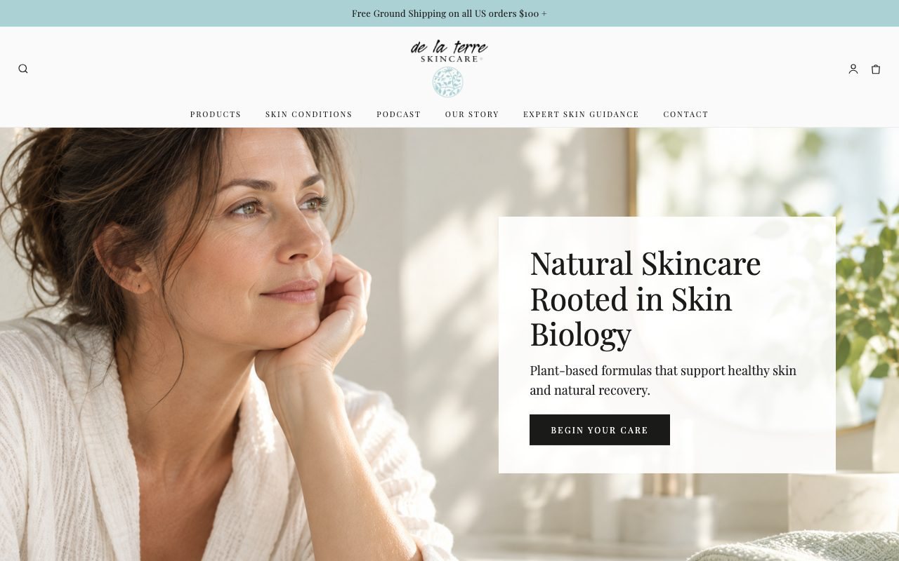
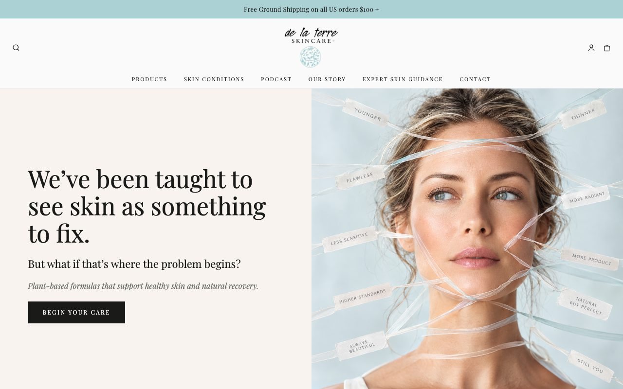
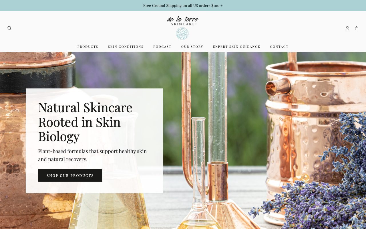
She started from Version 1 and added notes of her own: her products first. That is what was built.

She sees three versions of her homepage.
Her live theme is backed up, untouched.
The before pictures are taken.
Her pick goes live, after her yes by text.
Her live homepage. Label wording is blurred on purpose. Times from her case log.
from the before pictures to her pick live, one Sunday morning.
the time her homepage sat frozen while loading, before and after that day (same Google test).
her Google phone speed score, the middle of 6 runs on November 6. One run can swing 30 points, so we quote the middle.
“The site looks just beautiful. Something I have wanted to tackle for a long time. Your skill level and professionalism is something to marvel at.”Anne Willis, de la terre Skincare
Tell us your site and the one thing you would change first. Book, prices, gift cards, or something else.
We show you the change on your own site, with your words and photos. Nothing goes live without your yes.
We build that one piece, the top of your homepage for example, in your own theme. Your current version stays saved.
The free first request is one piece of a page, not a new website. Access comes as staff or a collaborator account, never your password.
Send us your homepage and pick one. We will show you the change on your own site before anything goes live.
WMOne accountable contact: Will Mosley. Start Right, Hendersonville. 19 years in the work.Start Right clients, by name.
“You really know how to make a grown women cry. The site looks just beautiful. Something I have wanted to tackle for a long time. Your skill level and professionalism is something to marvel at.”Anne Willis, de la terre Skincare
“I am thrilled with the site he completed for me ahead of schedule …”James Werning, Fox & Fiddle Productions
“Will, fantastic, you are amazing. Thank you so much.”Stephen Sedmak, Shope Creek Wilderness
“Each time he has communicated clearly with me, completed the project ahead of time, and exceeded both mine and my clients expectations.”Brandon Bobart, Pisgah Peaks Ventures
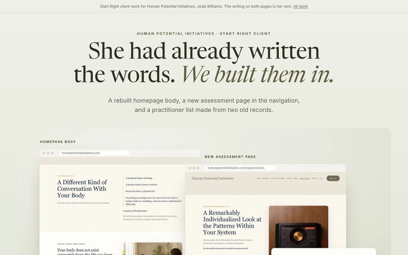
“Will, you really rock, like I’ve said multiple times … It truly amazes me that we’re at this point.”Joda Williams, Human Potential Initiatives
“Will quickly assessed my aesthetic, audience, and messaging; then generated a perfectly suited website at breakneck speed after a quick survey.”Andrew Capps, Capps Consulting
“You are a gift … I can tell you’re a person with integrity.”Anne Willis, de la terre Skincare
“Showing people having a great time, this is super high priority. This is beautiful content, thank you so much.”Billy Merritt, StarTribe
“He is, hands down, the best web developer I have ever worked with. … I can’t even name a problem that he helped me solve, because he helped me solve all the problems, literally every single problem.”Chasity Leake, The Celestial Collection
“It really turned out great. I get excited when I read it.”Joda Williams, Human Potential Initiatives
“Where have you been all my life … it looks great.”Anne Willis, de la terre Skincare
“Well, great work, I love the homepage, it is beautiful. … Thanks again, really good work.”Stephen Sedmak, Shope Creek Wilderness
“Before Start Right, I didn’t have an identity for my startup. … The unique business cards help me close more deals that I wouldn’t have if I didn’t have them.”Micah Valentine, Mobile Tech Roadside
“The best part of working with you is just that you’ll really see things through to the end … I would definitely recommend anybody work with you, just because you’re brilliant, smart, hard working.”Billy Merritt, Infinity Greens / StarTribe
“Will built me a fantastic site and was helping me tailor it to my liking every step of the way. He even took me on a tour through the background of the site and set it up in a way that makes it easy for me to go back in and tweak things if necessary.”David Santangelo, Shmoo Media
“The logo Will designed draws in my customers; It stands out above and beyond my competitors, and most importantly, it represents who I am and what I do.”Zyzxca Vonschondorf, Lil Bit’s Boutique & Event Planning
“The logos look amazing! … I appreciate you understanding my vision”Punam Medina, Shakti Shanti Studio
“Wow, Will that is beautiful …. Magnificent job. Thank you”Stephen Sedmak, Shope Creek Wilderness
“Will is delightful to work with and I highly recommend him if you are needing video production.”Pam Granger Gale, Majik Studios
“Today’s session completely blew me away. … I felt heard, supported, and creatively energized the entire time. I now feel confident moving forward with my website.”Joda Williams, Human Potential Initiatives
Businesses, nonprofits and one Army unit, through Start Right or while Will was employed elsewhere. Each case says which.
Holiday-Ready Day
Gift guide, shipping dates, gift cards and a clear phone checkout, one request at a time.
Until Mon, Nov 23, 8 AM ET