






“You really know how to make a grown women cry. The site looks just beautiful. Something I have wanted to tackle for a long time. Your skill level and professionalism is something to marvel at.”Anne Willis, de la terre Skincare
Start Right client work for Anne Willis, de la terre Skincare. Every word, image and product photograph on her site is her own. All work

de la terre Skincare · Start Right client
Her own words, in a better order.
Her home page felt cluttered. Start Right showed her three ways to fix it, built from nothing but her own words and photographs. She picked one, it went live in her own theme, and the rest of the day went on speed and on the small things a visitor notices.


- 3ways to order her home page, each built from her own words.
- 27→81on Google’s phone test for her home page, the same day.
- 170→72pxheader height while a visitor scrolls on a computer.
- 4products with prices, right under the main image.
The proposal
Three ways, in her own words.
On October 22 she saw three versions of her home page. Each gave a visitor a different first step, and each used only her exact words, her own images and sections her theme already had. A script checked every line against her live site.
-
Version 1
Start with your skin
Visitors find their skin first, then where to get guidance, then the four steps.
-
Version 2
Your point of view first
A visitor meets the way she thinks about skin, then her, then where to start.
-

Version 3
The routine, simply
A visitor sees the four steps right away, with guidance close by.
She started from Version 1 and added notes of her own: her products first. That is what was built.
Her pick, live that morning
Right under the main image, what she sells.
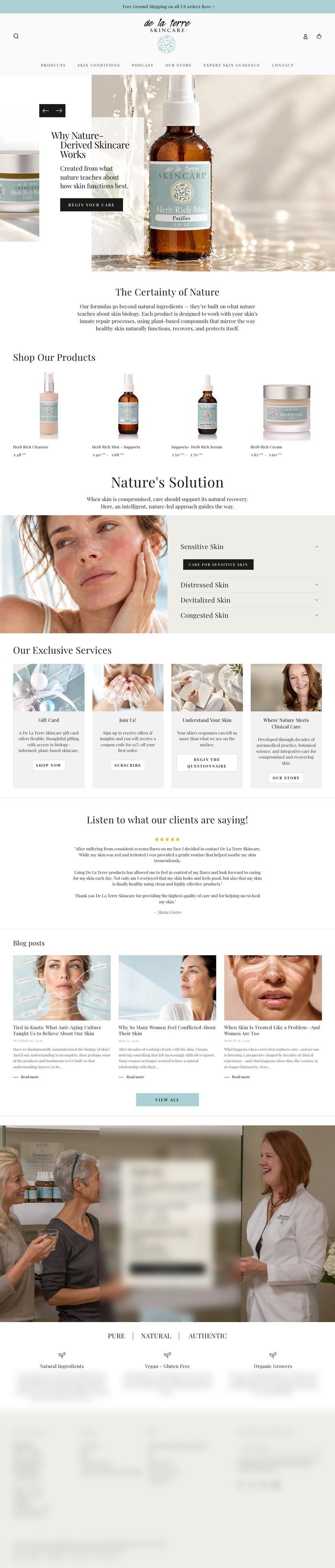
Four full width step banners gave way to her products with prices, then her services together in one section. It was built on a copy of her theme, published on October 25 after her yes by text, and her previous version stays saved as a draft. Her own edits were kept.


The same stretch of her home page, at one scale. Her skin guide and label wording are blurred on purpose.
Speed
27 to 81 on Google’s phone test.
Google PageSpeed Insights scored her home page 27 on a phone at 6:38 AM and 81 at 5:35 PM. Besides the new layout, an app that had been switched off was still loading a leftover script on every page, about five seconds of phone processing. It no longer loads.

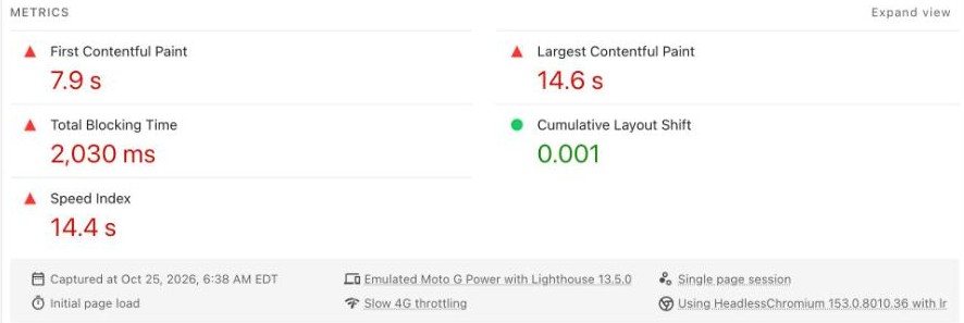

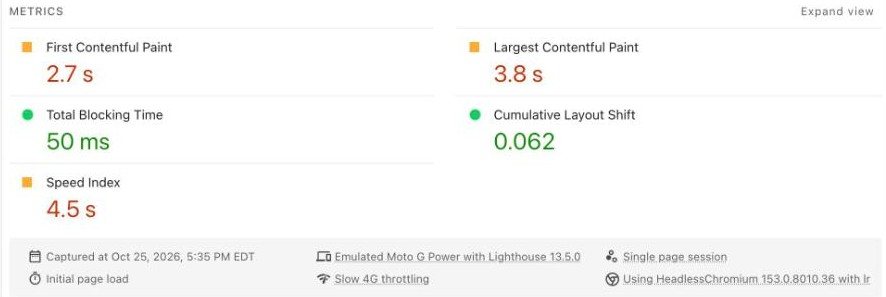
| Google phone report | 6:38 AM | 5:35 PM |
|---|---|---|
| Performance score | 27 | 81 |
| First words on screen | 7.9 s | 2.7 s |
| Main picture on screen | 14.6 s | 3.8 s |
| Time the page sat frozen | 2,030 ms | 50 ms |
| Speed Index | 14.4 s | 4.5 s |
| Best Practices | 77 | 96 |
| SEO | 100 | 100 |
| Accessibility | 94 | 91 |
| Layout shift (still in Google’s good range) | 0.001 | 0.062 |
The claim is Google’s test and nothing more. Scores move a few points between runs, and Start Right’s own slowed down lab test did not show the full load time improving, so no load time gain is claimed.
The header
A header that gets out of the way.
While a visitor scrolls on a computer, the header bar now slims from 170 to 72 pixels, so more of her page shows. At the top of the page her logo stays full size.


Phones
Words that sit on a soft box.
On phones, her theme hid the box behind the words on two of her heroes, so the words sat right on the photo. The box now shows there too, and holds a steady height between slides.
- Her blog posts stack top to bottom on phones.
- Her Pure, Natural, Authentic row stacks instead of running off the screen.
- Images no longer wait behind a loading bar setting.

Understand Your Skin on a phone, before and after.
Her products
Her products, her order, her menu.
Cleanser, mist, serum and cream, in the order she uses them. Menu items holding one product now open that product directly, and a button that only said Learn More now names the page it opens.

Her product row on a computer. Label wording blurred on purpose.
★★★★★
“You really know how to make a grown women cry. The site looks just beautiful. Something I have wanted to tackle for a long time. Your skill level and professionalism is something to marvel at.”
Anne Willis, de la terre Skincare
The whole page
Same words. A shorter walk.
Her whole home page that morning and that evening, at one scale. Nothing of hers was cut; it was put in a better order.

Start Right Care
Your home page, in your own words.
Send us your priorities and we work a full day on them: 8 service hours for $480, with before and after.
CreditStart Right client work for Anne Willis, de la terre Skincare, in October 2026. Every word, image and product photograph on her site is her own. Start Right proposed the order, built it in her theme and did the speed work.